The Cado
An identity for an avocado-focused food experience, built around freshness and typographic contrast.
- Client
- The Cado
- My role
- Visual identity
- Context
- Visual identity project
Overview
The Cado is an avocado-focused cafe concept featuring food ideas such as avocado toast and avocado smoothies. This visual identity project connects that food focus with a fresh visual character.
The brief
Give the avocado-led idea a recognizable identity while keeping the visual language approachable and food-focused.
What I did
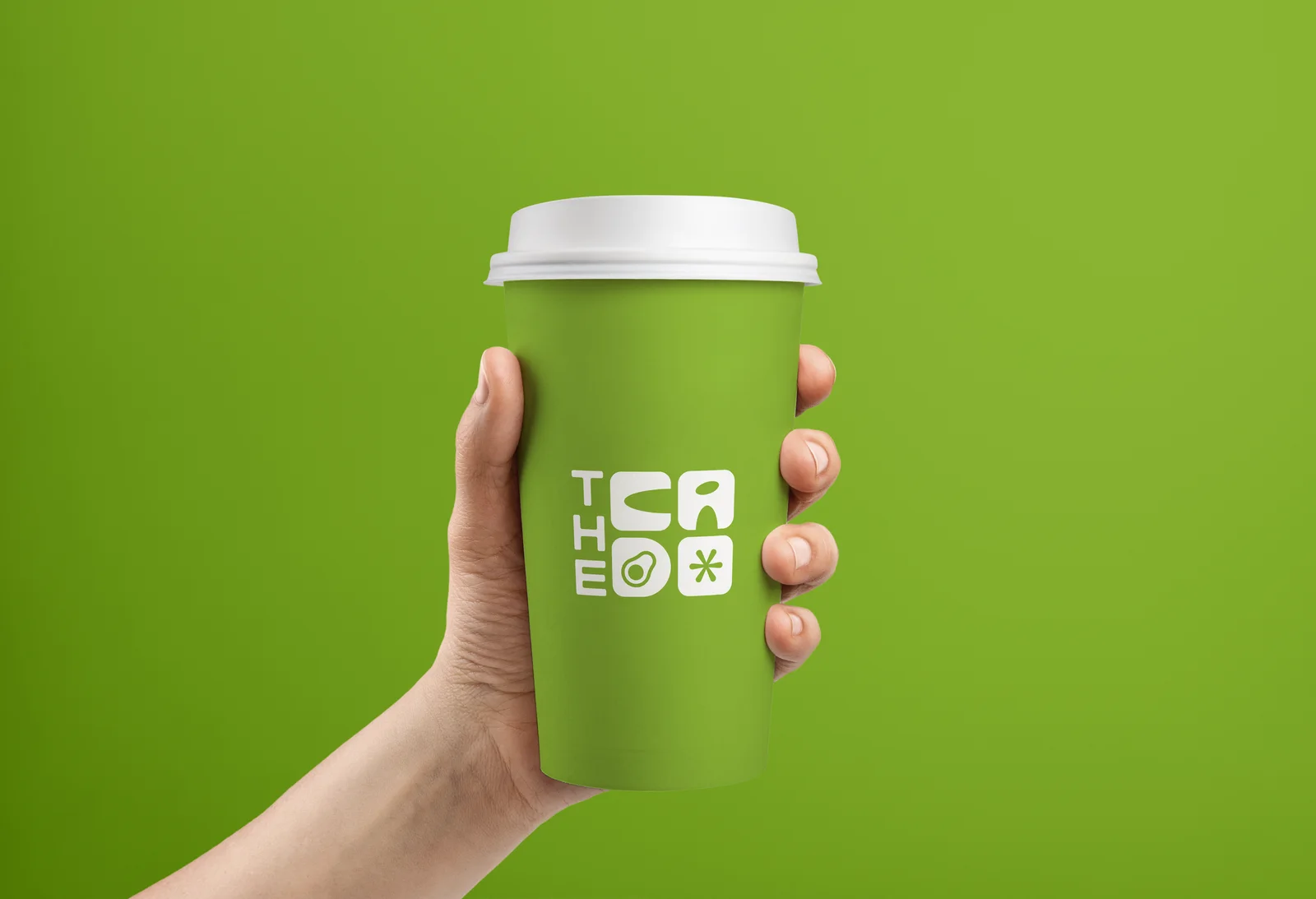
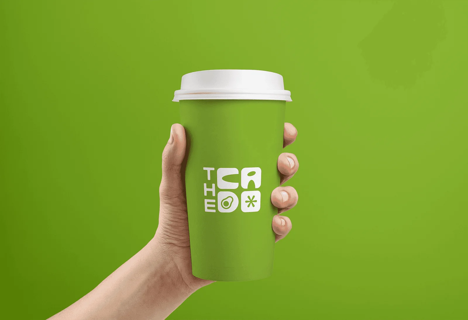
The identity direction uses a green palette to represent freshness. An avocado-inspired idea is incorporated into the “d” in Cado, while an elegant treatment of “The” contrasts with a bolder Cado wordmark.
Delivered work
A visual identity project centered on the avocado concept. No additional business or launch details are claimed.